

Covid-19 Vaccine Excess Death Signal?
Maybe, but it could just be coincidence, cherry picking, conformation bias or just another KRAP Analysis on my part.

In a discussion with Madeline in her substack
comments section we were discussing the pros and cons of different baselines and I couldn’t resist “pimping” the Human Morbidity Database (HMD) website/app below as a great place to look at the different results you can get by using different base lines. I was also “pimping” other HMD database datasets in ’s comment section for other reasons as I’d just discovered the other data that is available on the HMD website (not the app) if you are a registered user. My “pimping” of the app and website has probably has probably annoyed both of them in the process 😀.This post is just a quick example of what can just pop up if you change the way you calculate the baseline. I found the graphs surprising and interesting enough to share. The result just popped up when I was playing with some different settings while trying to show Madeline an example of how useful the app can be and what can be done with it. I really didn’t intend on writing a full post about it, but didn’t want to just post it without an explanation of what it’s about in case other readers stumble across it in the future, the results were interesting to me, but it may not be as interesting to others. Hence, no email notification was sent out. If you’ve found this post by accident hopefully you’ll also find it slightly interesting and I encourage you to have a “play” with the app yourself and see what else just pops up.
Have I found a real signal in Australians 85+?
Maybe, but I doubt it. It’s probably just an artifact but it could be worth investigating further. The app lets you do a bunch of “what ifs” like the example below without having to download the data and crunch the numbers yourself. If you find something interesting you can always go back and see if it makes sense and investigate it further the data are available as a csv and the app is open source. 👍
I first came across the app in one of
’s posts where he explores an article by Ron Unz where Unz use data from the app to explain why obesity is the cause of the US excess deaths and not the vaccine (or something like that). That got me thinking about the difference between US and Australian excess deaths, so I wrote the “The Eagle and the Emu” (see below) using graphs I generated using the app to show the differences between the US and Australia. Those graphs would have taken me days if not weeks to prepare without the app i.e. find the data (deaths by age group and population for both counties), then filter and crunch the numbers by category and then produce the graphs.The Eagle and the Emu

I was reading a great article by Brian Mowrey who writes Unglossed titled “American excess mortality does not reflect Covid vaccine harms (yet).” In the article Brian discusses another article by Ron Unz, “Obesity and the End of the Vaxxing Debate?” (2023, January 9.)
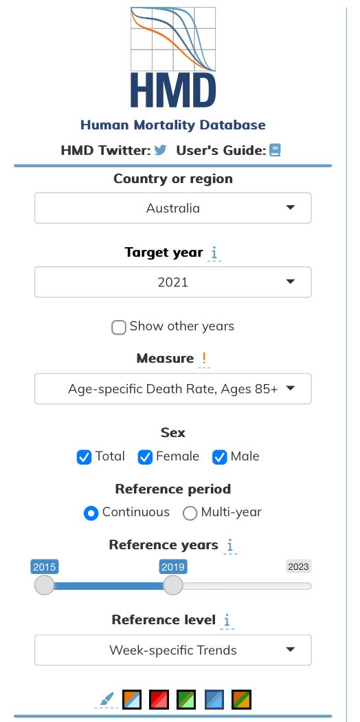
Settings used to generate the graphs in the example below:
Web site: https://mpidr.shinyapps.io/stmortality/
The “week specific averages/trends” is interesting but to me it is a bit of a weird baseline, but apparently it is something that is commonly used by demographers so they have included it as a “standard feature”. I can sort of see why someone would use it, but I do prefer what Madeline has done. Madeline’s logic seems to make more sense (to me). Have a read of her post below to see her methods.
Week-specific Averages
Definition:
The Week-specific Averages for week i, equals the arithmetical mean over the years in the selected period and is given by
(1) where the set P contains all years in the selected reference period and |P| denotes the number of elements in the set P. The reference period may or may not include the target year.For the target year T and for week i, the reference level predicted by the Week-specific Trends, is the expected value of a linear model estimated by ordinary least squares (OLS) over the years in the selected reference period. If there are 22 weeks available in the target year then the reference level consists of the results of 22 independent linear models. The estimation is carried out via the lm function of the stats package in R [21]. The reference level is given by
(2) where and are the estimated coefficients of the OLS regression over the reference period for week i.
Results:
The Covid-19 Vaccine Rollout commenced in Australia 21 February 2021 when the first lucky recipient 70 year old Jane Malysiak received the the first dose. This puts it at about the end of week 8 on the graphs (depending on how they calculate the week number). Below is a plot of mortality in 2021 with excess shown in orange. Notice the large area in orange that appears shortly after the vaccine rollout begins, it’s more noticeable in the female graph and absent in the male graph, maybe there is something there but it’s not as obvious as the female graph. 🤔

Is this plot showing the primary series leading to excess deaths in those 85+ then boosting leading to more excess deaths?
Again, I’m not sure but it could be.
For those that don’t get what the graphs mean the simplest explanation is the “orange area is bad” and the “cyan (blue) is good” black is the actual death rate for the year (2021) based on the parameters and baseline chosen from the drop-downs.
The chart below is just the same results plotted with a different scale to try and make it a bit clearer.

Are women more likely to die from the vax?
The difference between adverse events between men and women keeps subtly popping up in a lot of data I’ve seen, maybe it’s just confirmation bias on my part but I do think the difference is real, but that’s just my hunch without any real evidence to back it up.
More about the methods can be found in the paper below written by the creators of the app:
“An open-sourced, web-based application to analyze weekly excess mortality based on the Short-term Mortality Fluctuations data series”
László Németh, Dmitri A. Jdanov, Vladimir M. Shkolnikov
https://journals.plos.org/plosone/article?id=10.1371/journal.pone.0246663
The apps R code can also be found on GitHub: https://github.molgen.mpg.de/nemeth/stmortality/blob/master/app.R
Try having a play with it and see what you find.