


Serfling Australian's Covid Waves
Measuring Australia's excess mortality during the COVID-19 pandemic (ABS Release: 30/03/2022. Western Australian excess deaths in 2021 and other KRAP.


You may be asking why am I sifting through the tailings of old Australian Bureau of Statistics (ABS) data?
I’m sure there aren’t any nuggets of gold left, but sifting through the tailings may have some value. There could be something that big miners have missed while looking for vaccine deaths, injuries or lack of effectiveness. The phenomenon that occurred in Western Australia (and possibly in some of the other states of Australians) doesn’t fit the MSM narrative. The data also seems to be counter-intuitive (to me at least). This old ABS article was found by me while looking for WA data. It contains excess deaths by state at a granular level (weekly).
I got exited 7% excess deaths in WA, but then I became sad, not statistically significant.

The chart above for Western Australia from “Catch up on the Actuaries Institute’s COVID-19 Mortality Working Group’s latest analysis of excess deaths”, posted 7 December 2022 really bugs me, their explanation1 just doesn’t sit right.


South Australia maybe a better candidate for inspection as the ABS says it statistically significant.
It doesn’t appear that this ABS data will answer my questions, but I was intrigued by the figures given for excess deaths, as they don’t match my expectations, based on MSN news reports and even theories proposed by COVID-19 vaccine skeptics.
How could it be that in 2021;
Tasmania had 10% excess deaths,
Northern Territory had -11% excess deaths (yes, that a minus, deaths actually decreased, it’s not a typo!)
and only Victoria and South Australia are considered statistically significant as reported by the ABS? (Looking at the ABS spreadsheets in detail, it would appear that the Northern Territory does actually meet their criteria of statistical significance)
Trying to answer the question above made me look at the methodology used by the ABS i.e the Serfling Model.
Methodology
The analysis of 2020 and 2021 mortality data undertaken by the ABS is based on a model developed by Serfling¹⁰ and later adapted by the US Center for Disease Control (CDC) and New South Wales Health (NSW Health). This section provides an overview of how the model has been developed over time, key aspects of the model, and how the model has been adapted and applied by the ABS in this analysis.
The Serfling equation as used by the ABS
(skip this section if you understand the formula below)
Expected(proportion) = A + Bt + Ct^2 + D sine(2πt/52.18)+ E cosine(2πt/52.18)
where A, B, C, D, and E are the coefficients calculated from the regression.
Why would you use this formula?
It’s actually pretty good if you’ve got seasonal data, it’s also pretty straight forward, it’s easy to use and understand. It lets you draw a curved wavy line through your data points instead of a straight line like a simple linear regression.
The A + Bt part is just a simple linear regression. Where A is sort of the ‘average’ or ‘offset’ and B is the increase/decrease over time in weeks (t) i.e. the slope of the line.
The Ct^2 part lets you get parabolic curvature into the model.
The D sine(2πt/52.18) and E cosine(2πt/52.18) let you get your ‘wiggle on’. The sine and cosine are the ‘wiggle’ (or wave) and D and E are just ‘how much you want to wiggle it’ (it scales the height of the two waves) for each term. A negative number ‘flips’ the direction of the ‘wave’, it also allows you to shift the peaks and troughs from left to right a bit.
The 2πt/52.18 is just there to scare you and make it look more mathy and complex than it really is. It just scales the data so it fits properly over a year (52.18 weeks) and makes it repeat annually.
Add some error bars and your ready to go Serfling.

Criticisms of this approach
Looks all good and sciency, so what’s wrong with it?
In a nut shell it was originally intended for looking at seasonal flu waves. McConeghy also gives some technical criticism below, but it is useful as a demonstration of how excess deaths are model dependent.
Is it appropriate to use for what looks to be a non-seasonal pandemic illness in Australia and compare it to seasonal flu?
All the model shows is the variation of excess deaths from a flu/seasonal model, NSW was just lucky that it’s covid wave hit closer to the usual winter flu season peak making covid deaths not statistically significant. Victoria just happened to have it’s covid wave hit when the flu season wave was expected to be on the way down making it statistically significant. The unfortunate timing of the Victorian covid wave made their covid excess deaths statistically significant. Victoria would still have hit statistical significance for all cause deaths regardless, because excess deaths also occurred during it’s vaccine rollout period, but the statistical significance shouldn’t depend on the timing of deaths compared to the flu which had basically just vanished (there were only 2 deaths recorded by the ABS in all of Australia as being due to influenza, the lowest on record). New South Wales (557 deaths) and Victoria (553 deaths) had the highest number of covid deaths in 2021 according to the ABS “Causes of Death, Australia.” Western Australia (0 deaths), but they did have 3 deaths where COVID-19 vaccination was the underlying cause of death (see notes in table below). All the model is really telling us is whether the current thing causing death (covid or something else) is more or less deadly than the historical thing that was causing deaths (flu and other seasonal illness).
Maybe it was the huge number of cases2 and long covid in the other states that caused excess deaths? Yeahnah3.

Side note:
Actually, this Serfling model may have something going for it.
“The Serfling and virological models consistently outperformed the ARIMAX model.” Using winter 2009–2010 to assess the accuracy of methods which estimate influenza-related morbidity and mortality M. L. JACKSON, D. PETERSON, J. C. NELSON, S. K. GREENE, S. J. JACOBSEN, E. A. BELONGIA, R. BAXTER and L. A. JACKSON 2015
If you compare each each cause of death individually rather than rolling everything together which seams to just produce non statistically significant results. One leading cause of death is suspiciously missing, heart disease. Was it not statistically significant or just not looked at? The ABS did include other causes of death in their article even though they weren’t statistically significant.
Why did ABS leave out heart disease?

Regardless of how I calculate the base line and work out the excess (I’ve tried a number of different ways not mentioned in this post) the magnitude of excess deaths in Victoria, South Australia, Western Australia and Tasmania just won’t go away.
Well looks like you can reduce the magnitude of excess deaths and get rid of South Australia if your a good actuary. I think they keep changing the baseline to keep us guessing.

Why didn’t the ABS use the big spanner (ARIMA) like ?
Possibly for the same reason I shouldn’t be trusted with a gas axe, it’s powerful tool in the hands of a professional but dangerous in the hands of a noob (like me), you might unintentionally set your pants on fire (don’t ask me how I know).
Serfling Model Background, Kevin W. McConeghy, 2019-06-06
The historical Serfling model should be considered as important background and an useful educational tool. But probably not applied in an research project.
The authors view the approach as a pragmatic one in the context of the 1960s when computation was difficult, but its implementation is now somewhat dated given modern computing methods. The constrains of needing an easy to estimate linear model are no longer relevant to the modern analyst. The use of a Fourier term to obtain fitted estimates and coefficients for “off-season” timepoints, then construct fitted lines for “on-season” timepoints makes many untested assumptions about the functional form and fixed parameters of seasonal influenza trend lines.
More elegant models (e.g. ARIMA, splines) are now available which may overcame the above limitations, and make fewer assumptions about the functional form.
Additionally the approach is dependent on an accurate baseline period. Whether to include mild or known epidemic seasons, which cut-off to define as the influenza season (e.g. week 40 - week 20) are important but subjective decisions the analyst must make.
The selected threshold for what constitutes “excess” is somewhat arbitrary. The original Serfling paper describes 1.64 standard deviations for 2 or more weeks as criteria. Recent papers have used the 95% prediction interval.
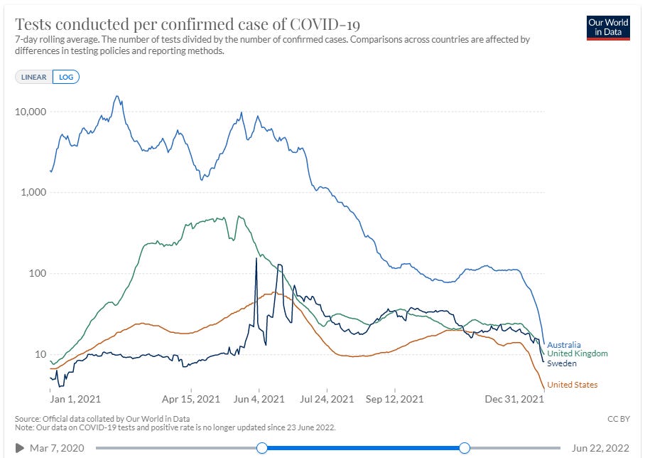
Did Australia even have an pandemic/epidemic in 2021?
No matter what you think about the false positive rate, having to test over 1,000 and sometimes testing over 10,000 people to get one positive test sounds pretty much like there wasn’t very much, if anything to detect. Note the synchronous onset of Omicron at the end of the year in the counties graphed, it must have traveled at the speed of science, well it could have traveled at the speed of a plane so not an impossible coincidence.
Causes of Death 2021
New South Wales (557 deaths) and Victoria (553 deaths) had the highest number of covid deaths in 2021 according to ABS “Causes of Death, Australia.” Compared to 15 deaths for which the information provided to the ABS indicated that COVID-19 vaccination was the underlying cause of death. 2021 also saw the introduction of COVID-19 vaccinations globally. The World Health Organization subsequently issued the ICD-10 emergency code U12.9 (COVID-19 vaccines causing adverse effects in therapeutic use). This code allows COVID-19 vaccine-related deaths to be identified separately from deaths involving adverse reactions to other vaccines and biological substances. Cases coded to R99 made up 9.8% of the coroner referred deaths dataset in 2021, compared with a historical average of 6.3% for preliminary data.

Conclusion

The Australian Bureau of (Lies, Damned Lies and) Statistics
makes some other great observations about ABS statistics if you want to read more about it if you like this sort of stuff.Interesting one of the actuaries Ms Cutter said there were no excess deaths in January, that is true, but why is a professional actuary with 25 years experience appear to be cherry picking the data in an interview with news.com.au on the 8 December 2022 (abridged version below with my emphasis in bold).
Blind Freddy can see there is something wrong here. I think they may have access to more data than is publicly available, their estimate of covid deaths looks suspiciously like they received data from the December ABS report early. Their figure is pretty much the same as the unreleased (at the time) ABS data, but they've said it's about 8,200 in September and not in November as shown per the latest release from the ABS, they appear to be squeezing the covid deaths into a tighter time period to increase the covid death rate.
Esterman quotes an outdated report, the actuaries seem to have access to an unreleased report. Very strange!
‘Zero evidence’ of vaccine link
(...)
“There is no credible evidence to suggest that Covid-19 vaccines have contributed to excess deaths in Australia or overseas,” the TGA said.
Ms Cutter also rubbished those claims.
“There is zero evidence that vaccines are causing these deaths as far as I’m concerned, but I cannot prove it,” she said.
(...)
Moreover, she noted the timing of the excess deaths “doesn’t match with the vaccine rollout, and the age profile of people dying does not match with people who’ve been vaccinated”.
“Hardly any young people are dying,” she said. She also noted there was no excess mortality in Western Australia in January and they were “just as vaccinated as the rest of the country”.
“The numbers do not stack up,” she added.'

Yeahnah: One of the best Australian conversation injections. To first acknowledge what has been said (both polite and courteous) and then to reject said proposal. All in the one word. Often mistakenly considered oxymoronic by other countries
For those that would like to see a Master at Work - John Dee
Trends In Causality for England, 2014/w23 – 2022/w46 (part 1)
https://jdee.substack.com/p/trends-in-causality-for-england-and
Trends In Causality for England, 2014/w23 – 2022/w46 (part 2)
https://jdee.substack.com/p/trends-in-causality-for-england-and-b8f
Trends In Causality for England, 2014/w23 – 2022/w46 (part 3)
https://jdee.substack.com/p/trends-in-causality-for-england-2014w23
Trends In Causality for England, 2014/w23 – 2022/w46 (part 4)
https://jdee.substack.com/p/trends-in-causality-for-england-2014w23-68a
Some other unrelated Masters at Work.
https://www.youtube.com/watch?v=J7rItS9oXpQ
Interesting article in Spectator Australia which shows comparisons using a different baseline.
"Pandemic survivors and the silent victims of excess mortality"
by Jason Steker
https://www.spectator.com.au/2023/01/pandemic-survivors-and-the-silent-victims-of-excess-mortality/
There is no argument from anyone that excess death are very high but no one seems to want to get to the bottom of it. So the cause remains a mystery.